The dashboard offers a bunch of helpful information right at your finger tips, but also a way to stand out and set yourself apart by customizing it to your liking.
Customizing Your Parameters
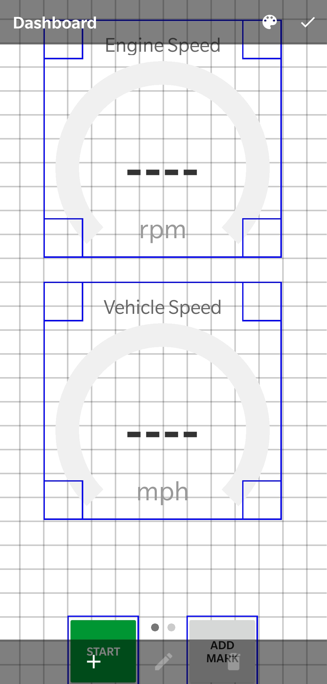
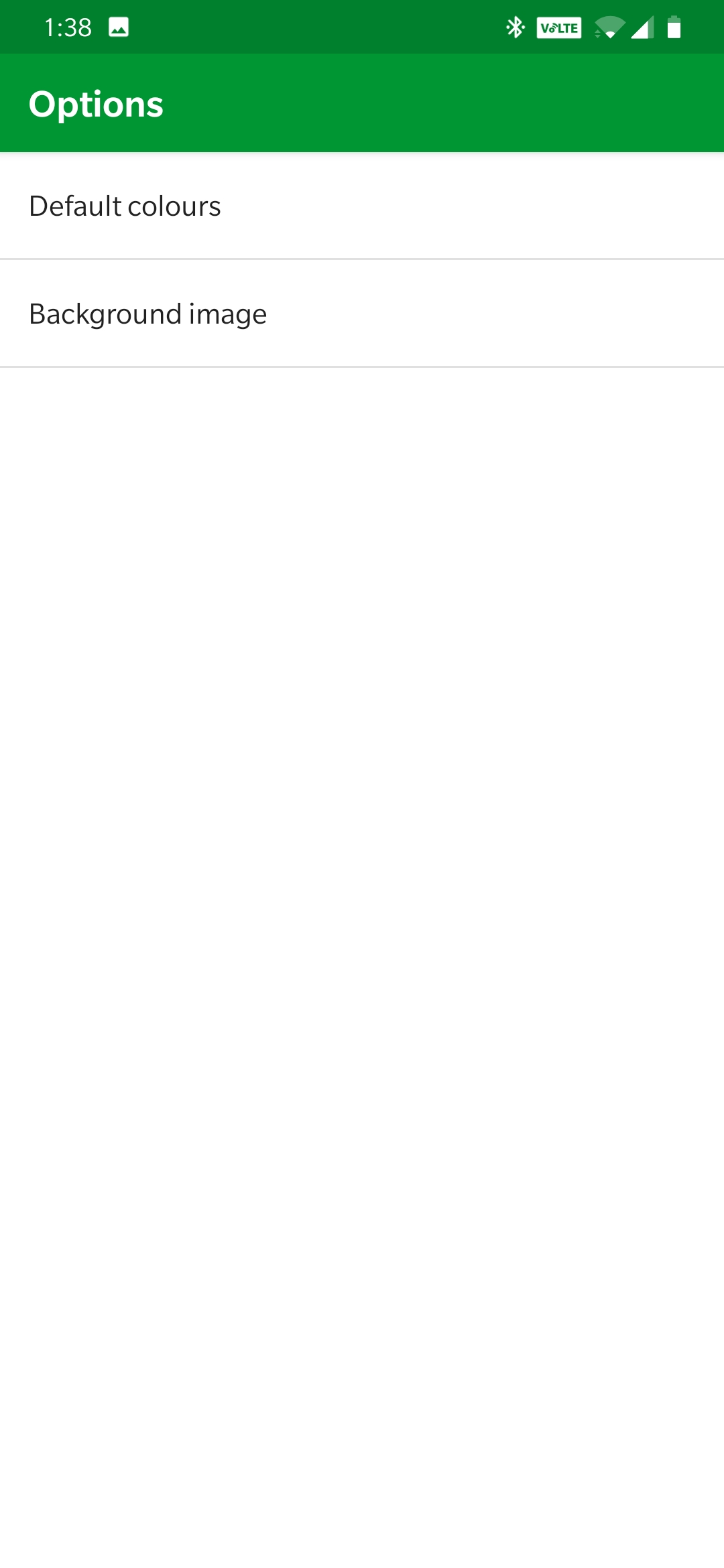
In order to customize the dashboard touch anywhere on the screen, from there click the pencil or gear to bring up the settings menus.


You can hold the corner squares in blue to adjust the size or shape of the gauge.
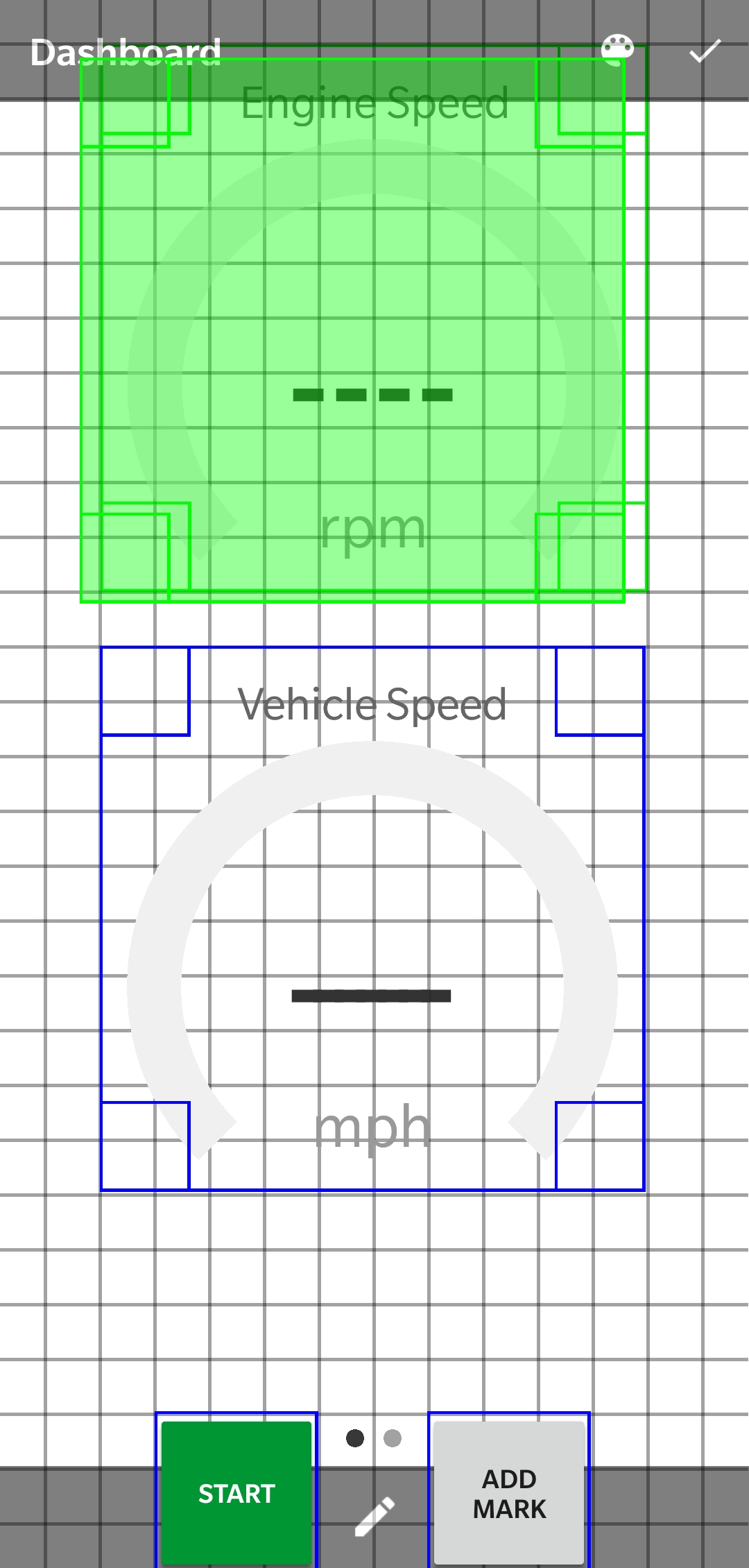
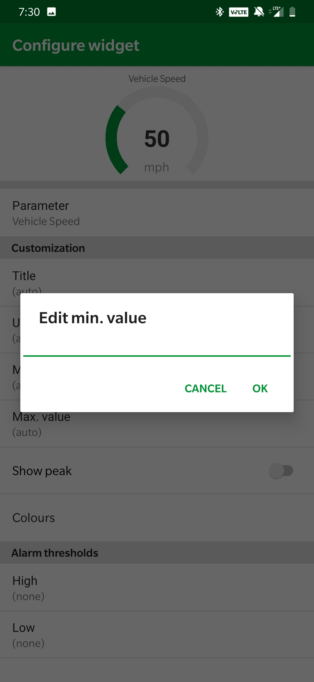
Tap the gauge to adjust the components of the gauge.
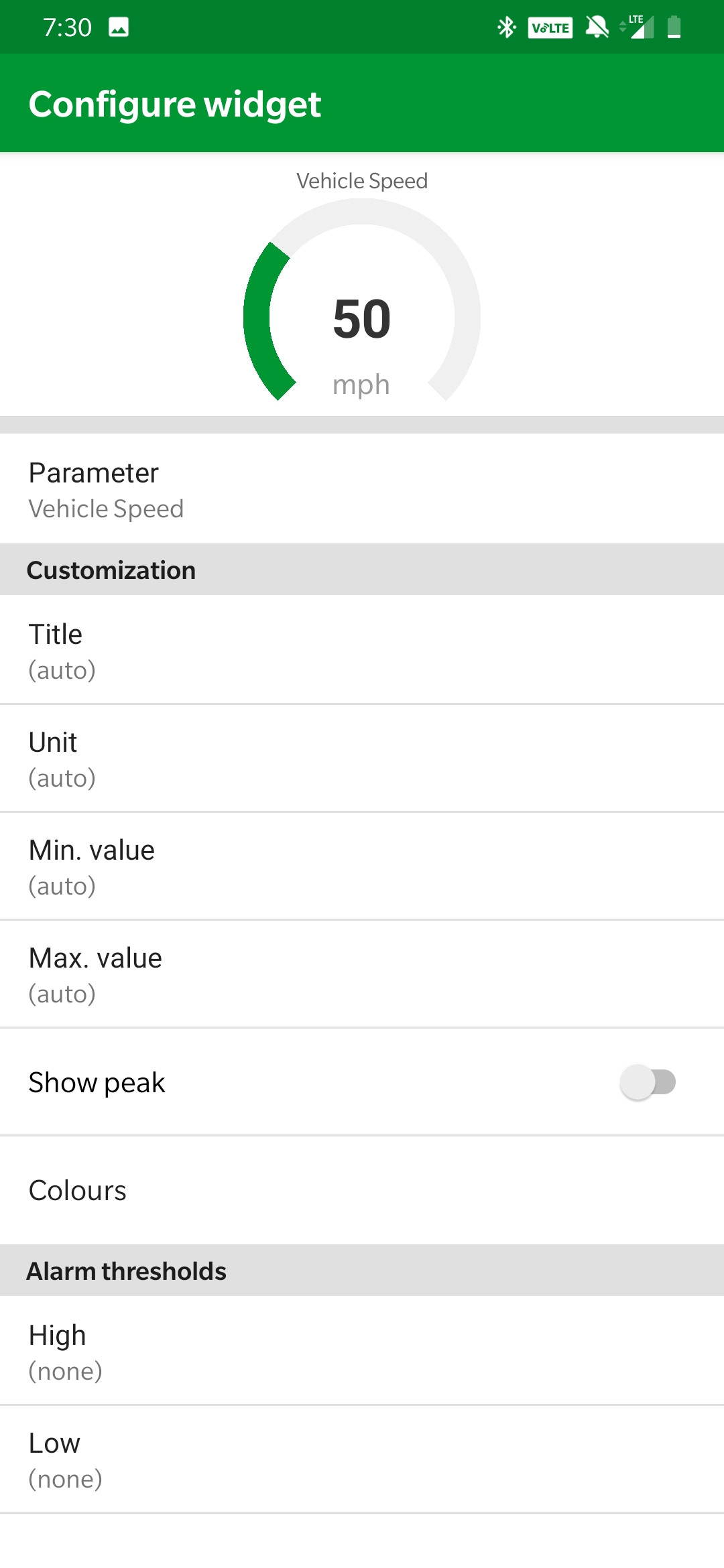
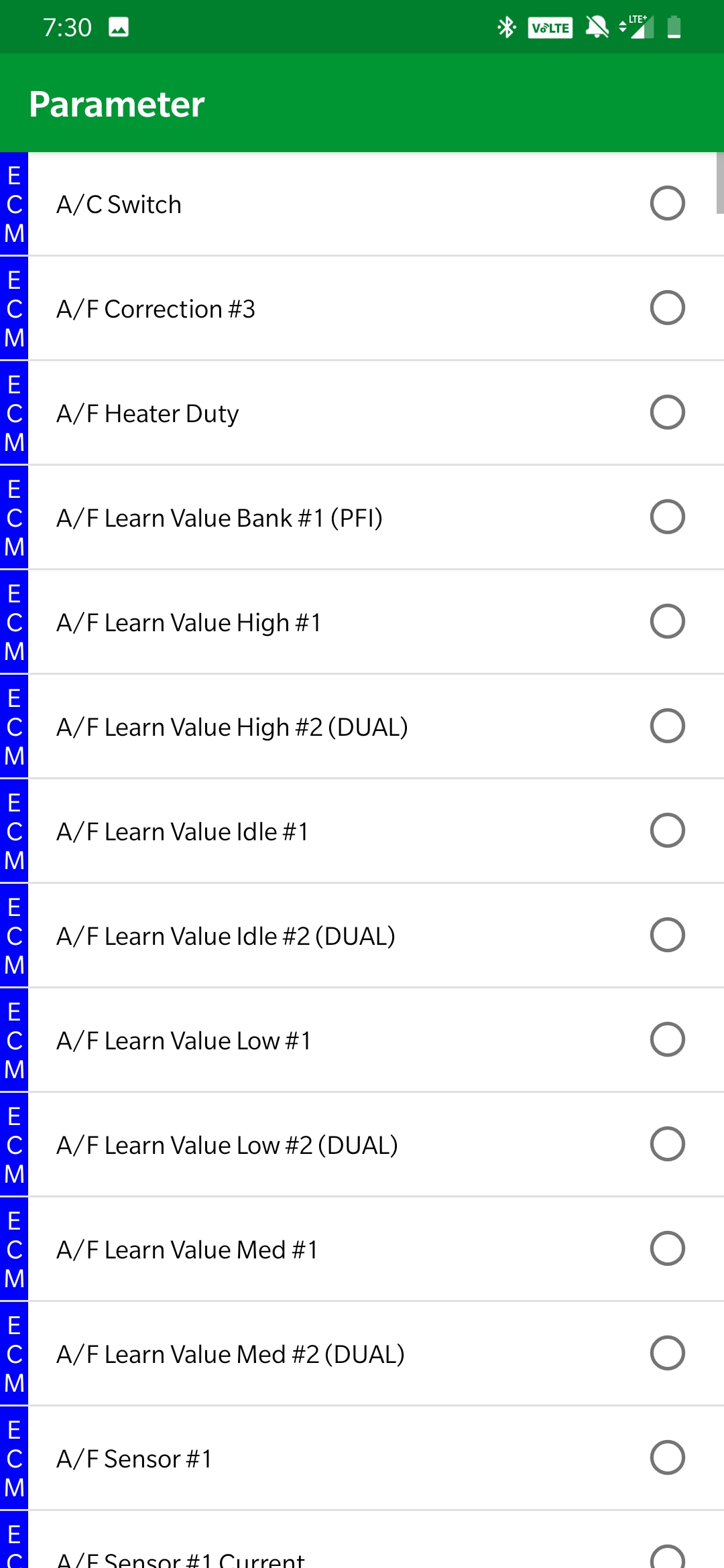
Adjust the parameters if you'd like to view a different live data item on that gauge.
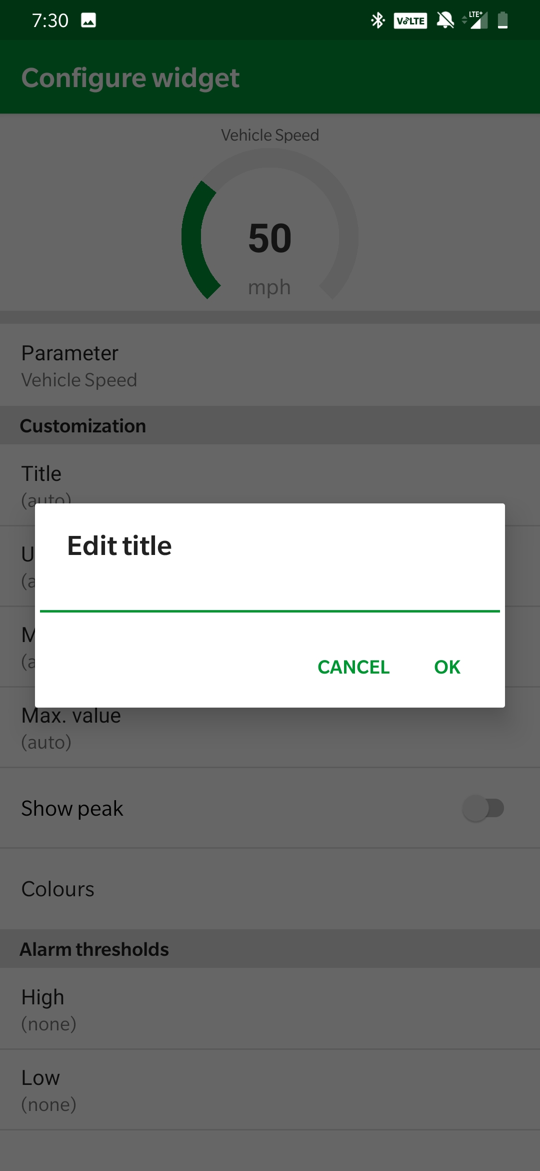
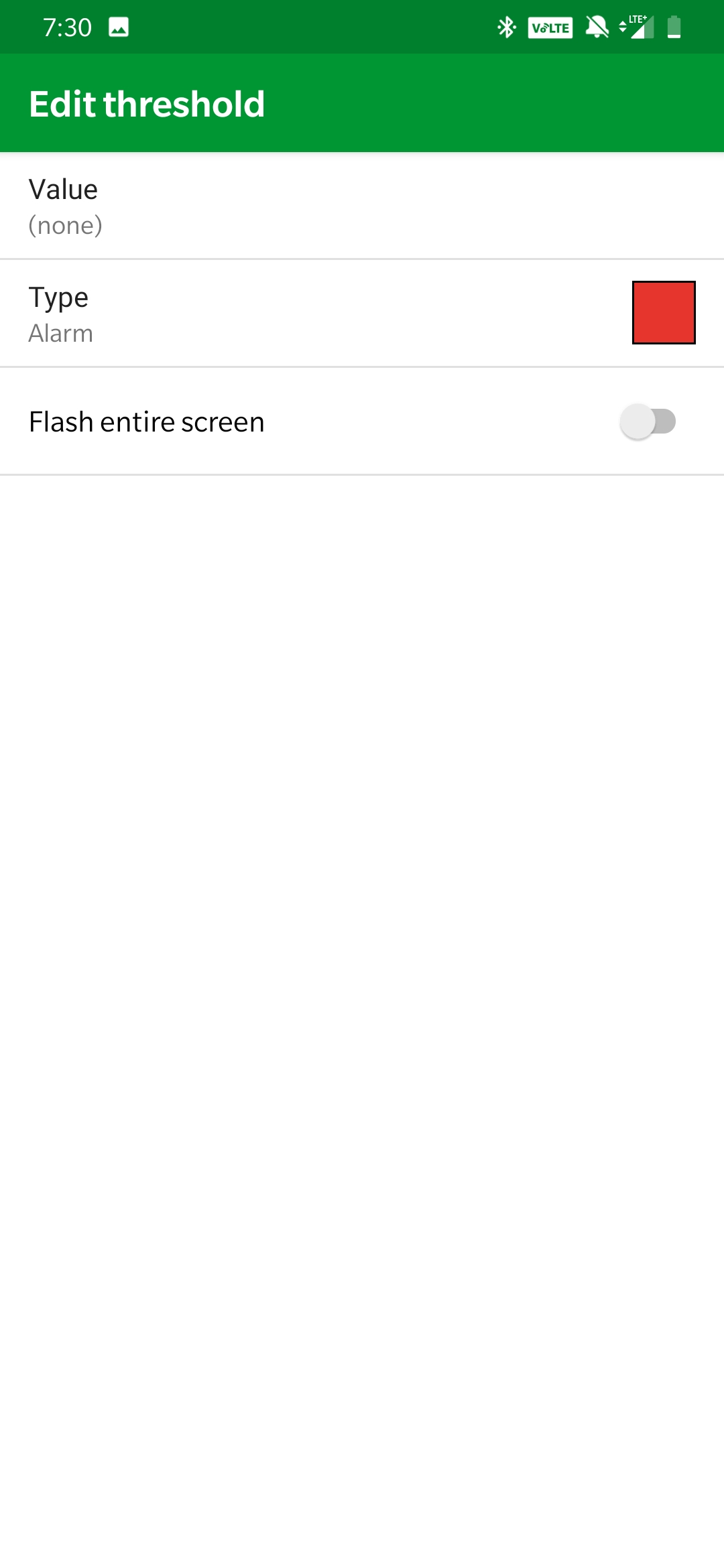
You can change the title of the gauge, the min and max values to adjust the scaling of the gauge, units, color scheme, or even adjust the warning in order to get advance notice of something going wrong.
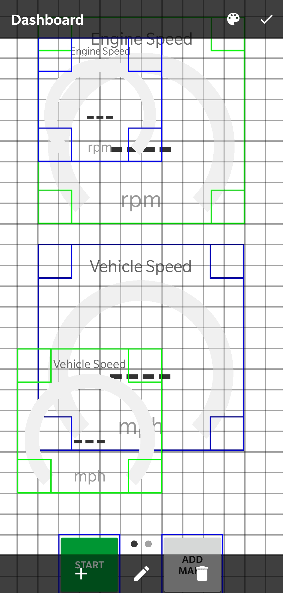
In order to customize the layout of your dasboard, navigate to the dashboard page and touch anywhere once, it should bring up the grey bar as shown below. For some ideas of what you can make it look like check out
| Child pages (Children Display) | ||
|---|---|---|
|


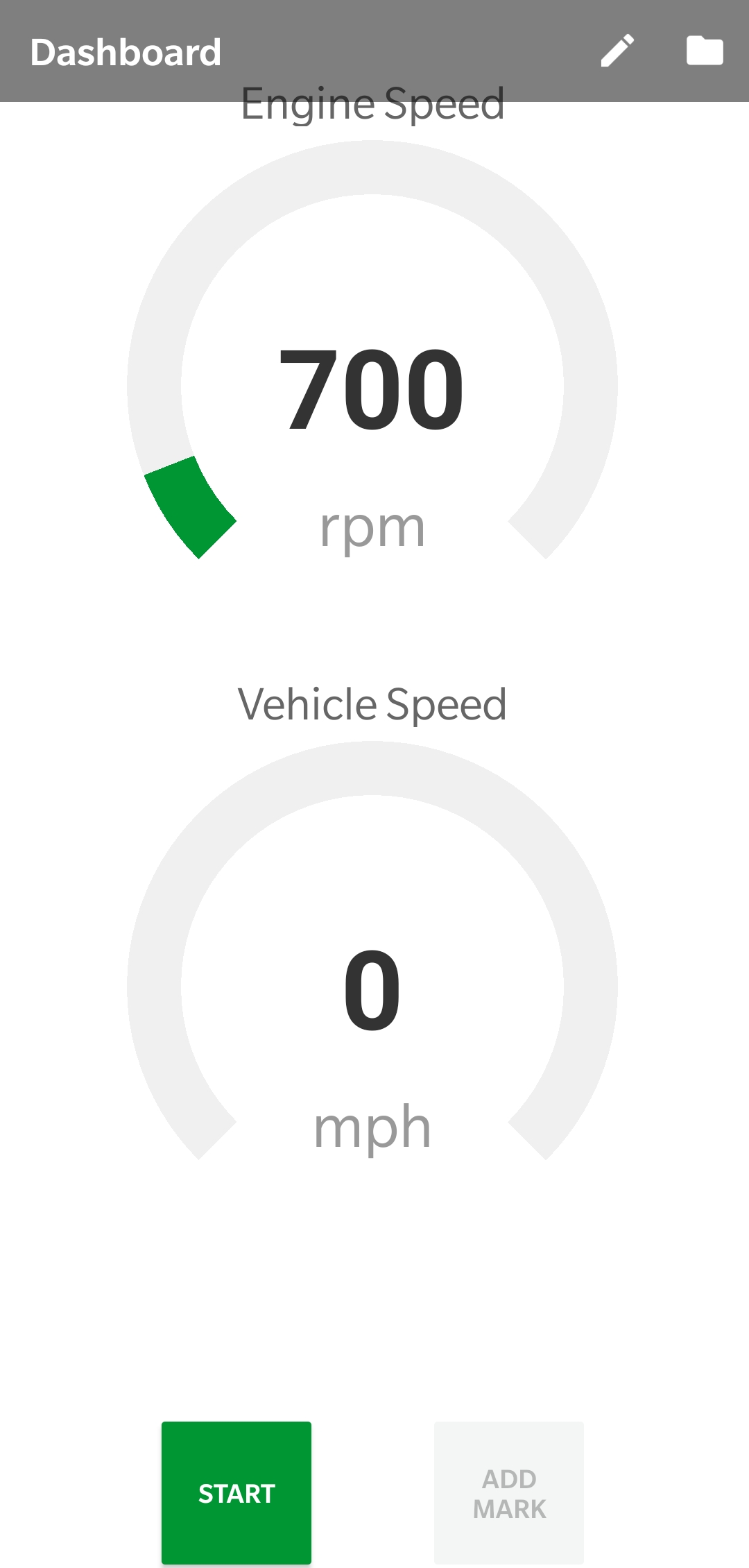
After pressing anywhere on the main dash page, select the pencil icon in the top right corner.


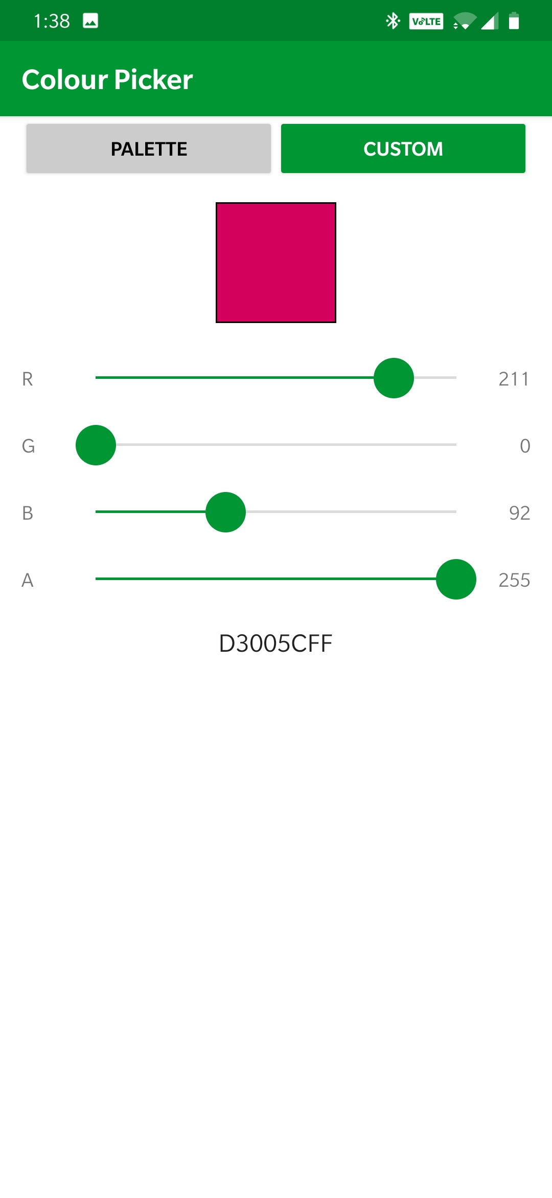
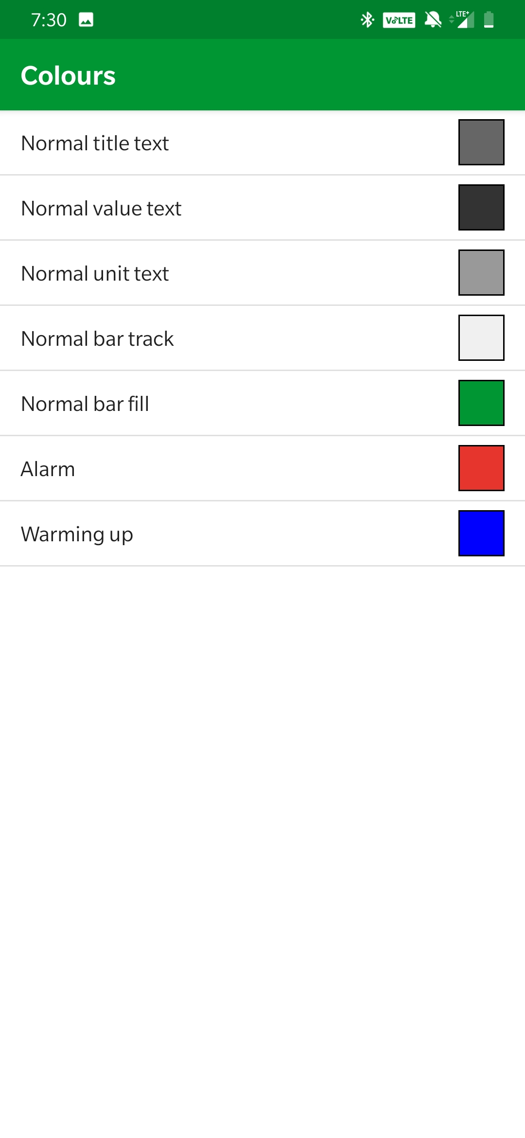
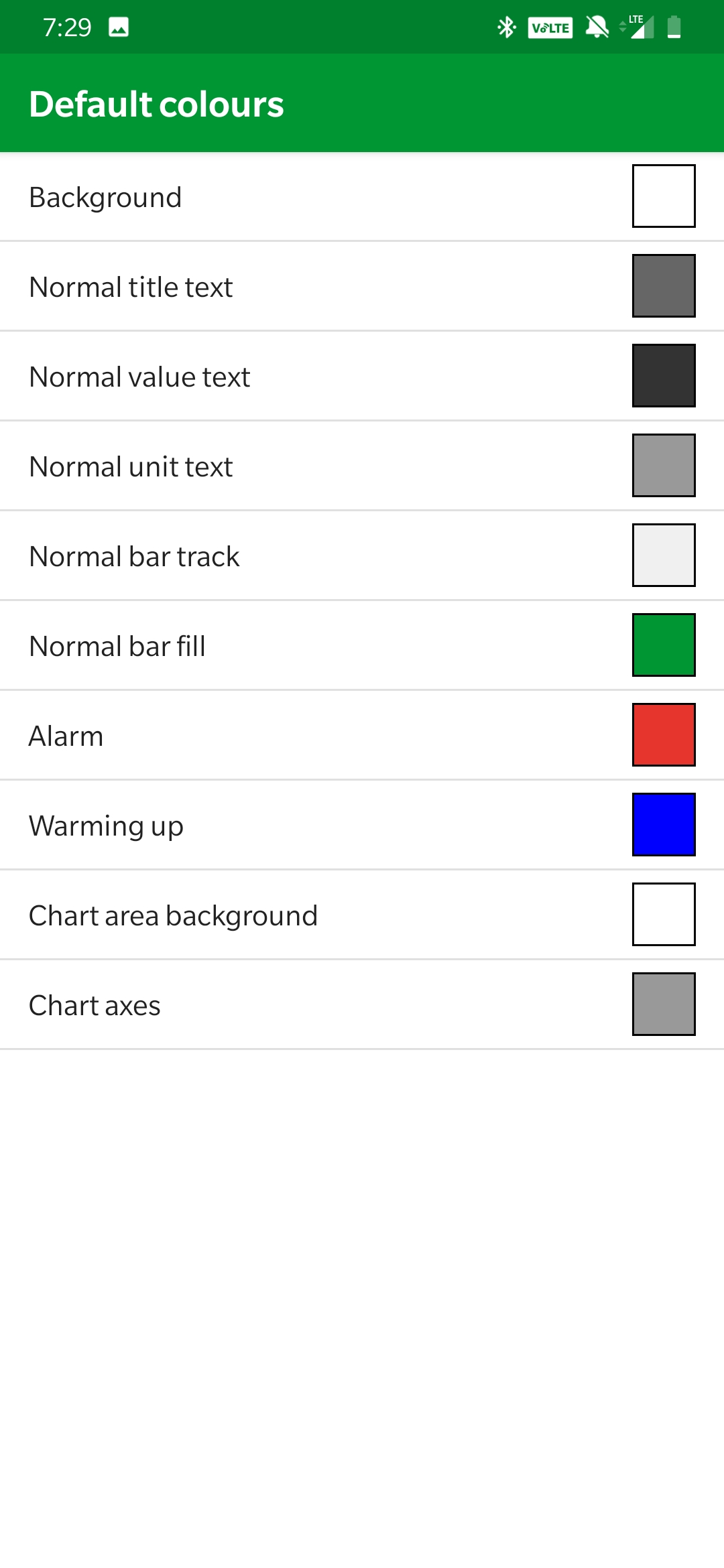
2. If you click the palette at the top you can then select default colors which will allow you to then adjust inidividual colors of your screen setup.

3. Select which parameter you’d like to change.
4. After selecting the parameter to change you’ll get dropped into a color palette to select a new color.
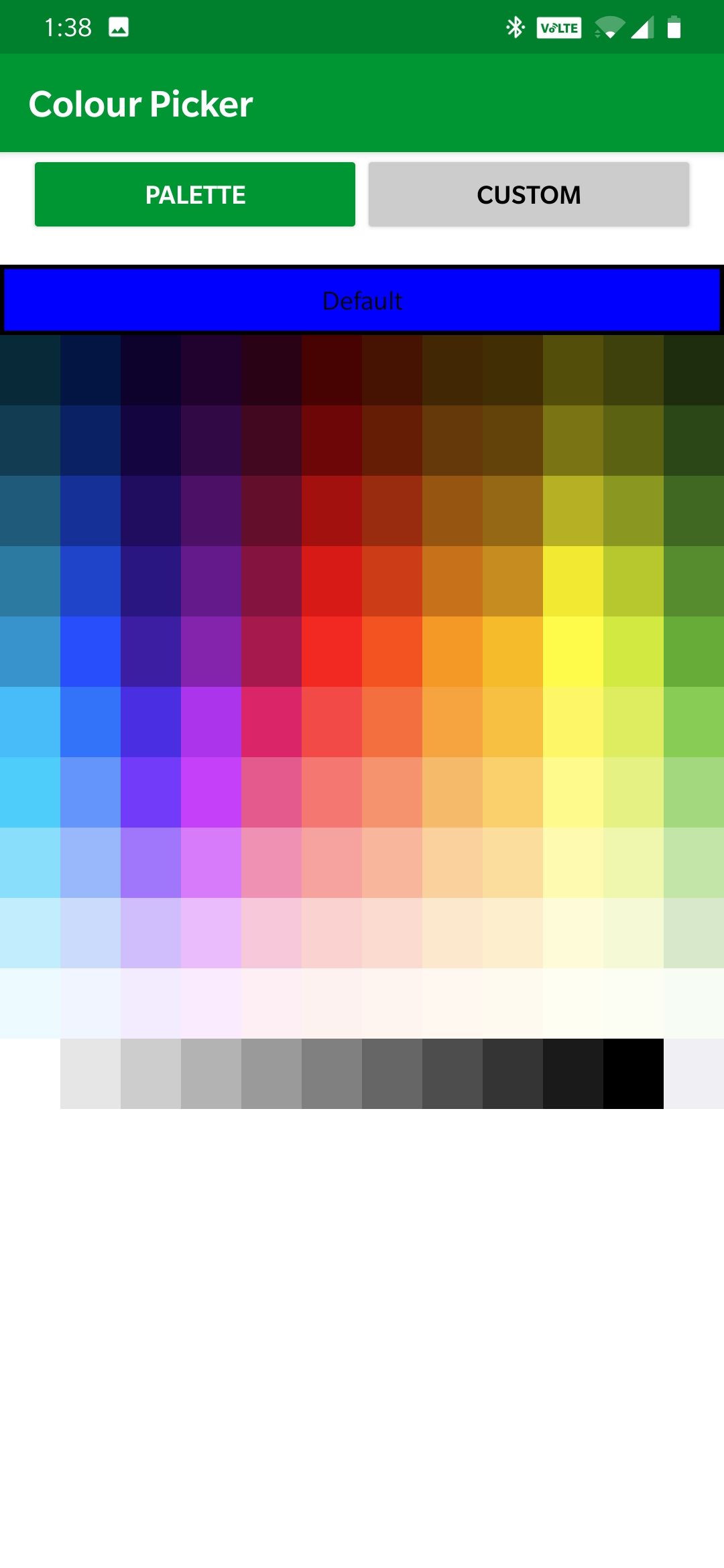
Alternatively you can use the custom button to choose or create a specific custom color.